Overview
In an increasingly interconnected world, the opportunity for students to embark on educational journeys abroad is invaluable. Recognizing the significance of global exposure, universities have established travel abroad programs to foster cultural exchange and personal growth. However, the existing travel abroad selection platform utilized by universities suffers from a notable design flaw, leading to a confusing and frustrating user experience. As a UX Designer, I undertook the challenge of addressing this problem and transforming the platform into a user-friendly and efficient tool for students seeking international academic experiences.
My Role
UX, UI Design
Team
Development
UX Design Team
UI Design Team
Product Owner
Stakeholders
Problem
Problem Description: Enhancing the User Experience of a University Travel Abroad Selection Platform
Introduction: In an increasingly interconnected world, the opportunity for students to embark on educational journeys abroad is invaluable. Recognizing the significance of global exposure, universities have established travel abroad programs to foster cultural exchange and personal growth. However, the existing travel abroad selection platform utilized by universities suffers from a notable design flaw, leading to a confusing and frustrating user experience. As a UX Designer, I undertook the challenge of addressing this problem and transforming the platform into a user-friendly and efficient tool for students seeking international academic experiences.
The Current Problem: The current travel abroad selection platform employed by universities lacks a functional design, thereby hampering the user experience and impeding students' ability to navigate the system seamlessly. Several critical issues contribute to this problem:
Complex Navigation: The platform suffers from convoluted navigation, making it arduous for users to locate relevant information and perform essential tasks. The absence of intuitive menu structures, clear hierarchies, and well-defined user flows creates confusion and hinders students' ability to explore available programs effectively.
Overwhelming Content: The abundance of information presented on the platform overwhelms users, making it challenging to find pertinent details about individual programs. The lack of effective organization, filtering options, and concise program descriptions makes it difficult for students to evaluate and compare different opportunities, resulting in a time-consuming and frustrating experience.
Inadequate Communication Channels: The platform lacks seamless communication channels between students, program coordinators, and faculty members. Limited feedback mechanisms, cumbersome application processes, and a lack of clarity in contact information hinder effective communication, leading to misunderstandings, delayed responses, and missed opportunities for students.
Inconsistent User Interface: The platform suffers from inconsistent design elements, visual styles, and interaction patterns, causing dissonance in the user experience. Inadequate visual cues, mismatched color schemes, and a lack of coherent typography further exacerbate the confusion and detract from the platform's overall usability and aesthetics.
Impact on Users: The current design flaws have a profound impact on students, the primary users of the travel abroad selection platform. The lack of clarity and ease of use discourages students from exploring and participating in international programs. Consequently, valuable opportunities for cross-cultural engagement, language immersion, and personal development remain unexplored. The frustration caused by the platform's suboptimal design diminishes the overall experience, erodes user trust, and may lead to missed deadlines or potential program abandonment.
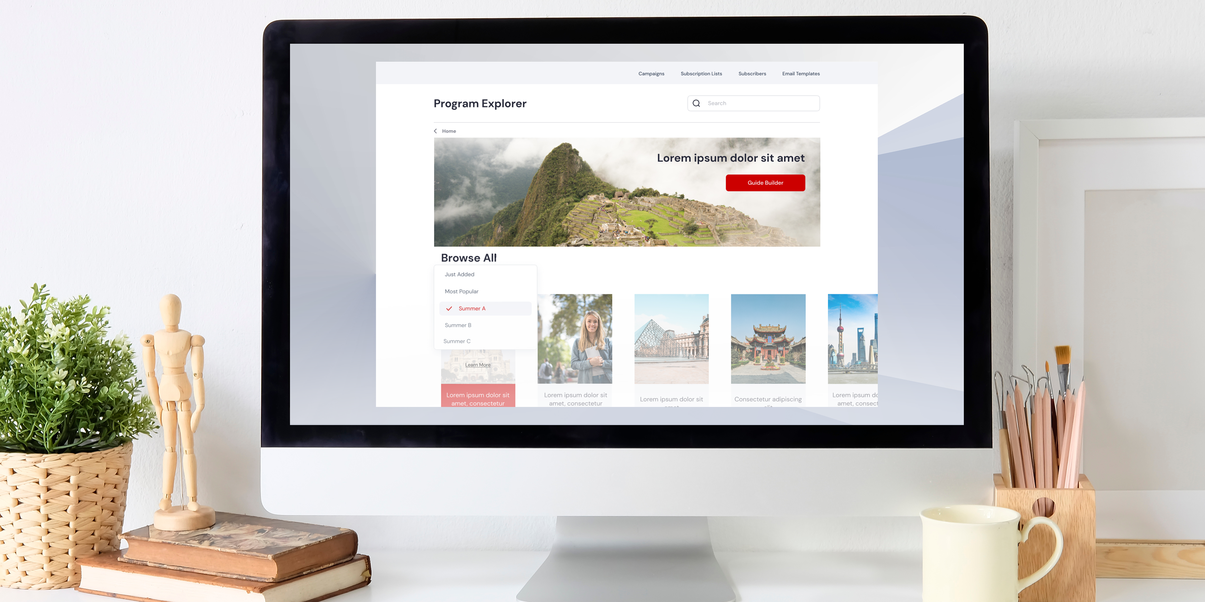
Solution
Solution Approach: As a UX Designer, my primary objective is to create an engaging, intuitive, and streamlined user experience on the travel abroad selection platform. To address the identified problems, my proposed solution involves the following:
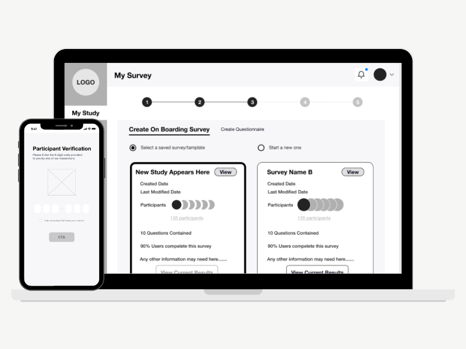
Streamlined Navigation: Implement a clear and intuitive navigation structure, ensuring easy access to essential program information, application processes, deadlines, and support resources. Employ user-centric design principles to simplify the user journey and enable effortless exploration of available programs.
Organized Content: Categorize and present program information in a well-structured manner, incorporating search filters, tags, and sorting options to enable users to find relevant programs based on their preferences and academic requirements. Create concise and compelling program descriptions that highlight key features and benefits.
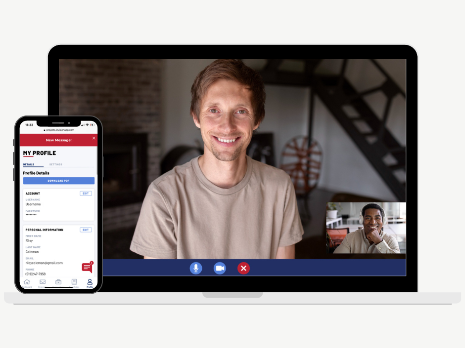
Enhanced Communication Channels: Integrate robust communication features, such as messaging systems and real-time chat functionality, to facilitate seamless interaction between students, program coordinators, and faculty members. Enable prompt feedback, clarify application requirements, and ensure students have access to reliable contact information for assistance.
Consistent User Interface: Implement a unified and visually appealing design system that establishes consistency in interface elements, visual styles, and interaction patterns. Utilize appropriate typography, color palettes, and visual cues to guide users and enhance the overall aesthetic appeal of the platform
Mobile

Survey


Campaign Metrics